Choose your portal's layout and voting style
Choose the page your portal opens on, its layout, the icon on the vote button, and your own colours. A preview shows the light and dark themes before you save.
Who can use it
Every plan includes these settings. An owner, an admin or a product manager can change them. Other team members can look, but they cannot change them. The settings are on the Branding page.
Choose where visitors land
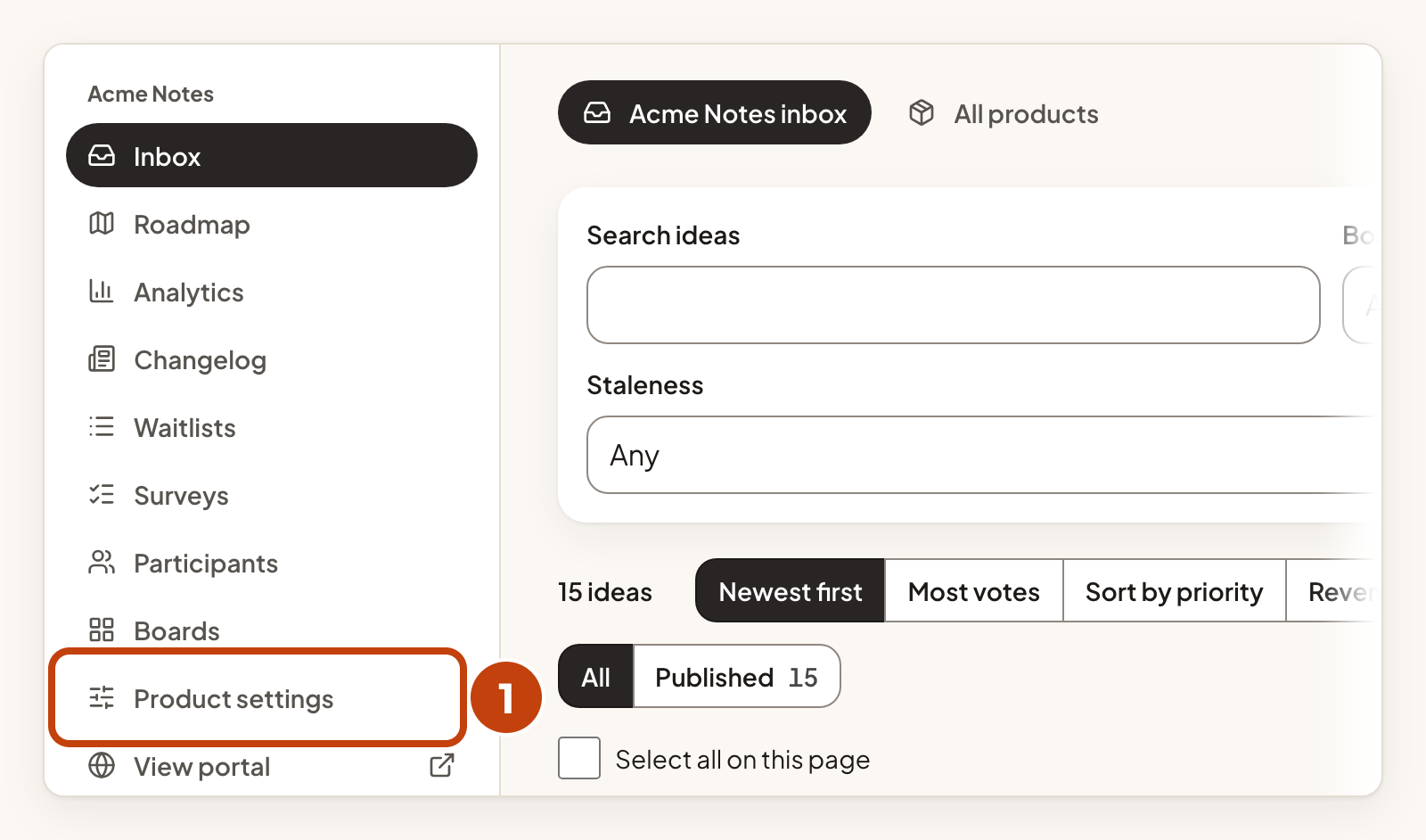
- Select Product settings in the sidebar.
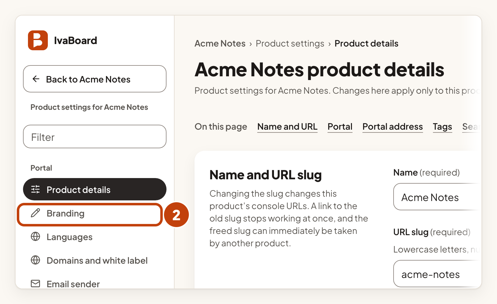
- Select Branding in the settings list.
- Under Landing page, choose the page visitors see first: Feedback, Roadmap, Changelog or Overview.
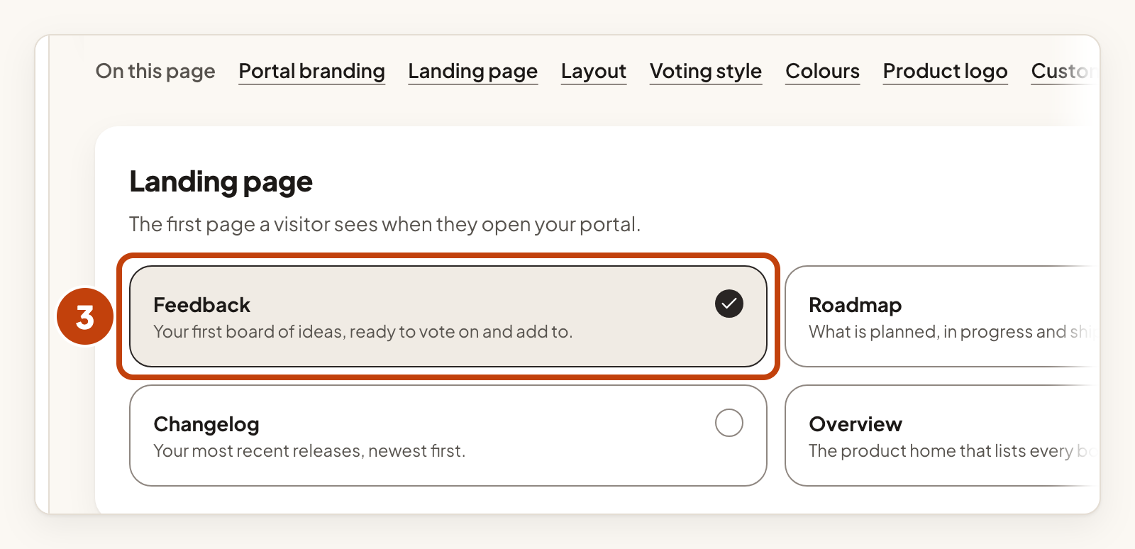
Feedback is the default. It opens your first board of ideas. Overview is the product home and lists every board. If a product has no visible board, visitors see the overview instead.
Choose a layout and vote icon
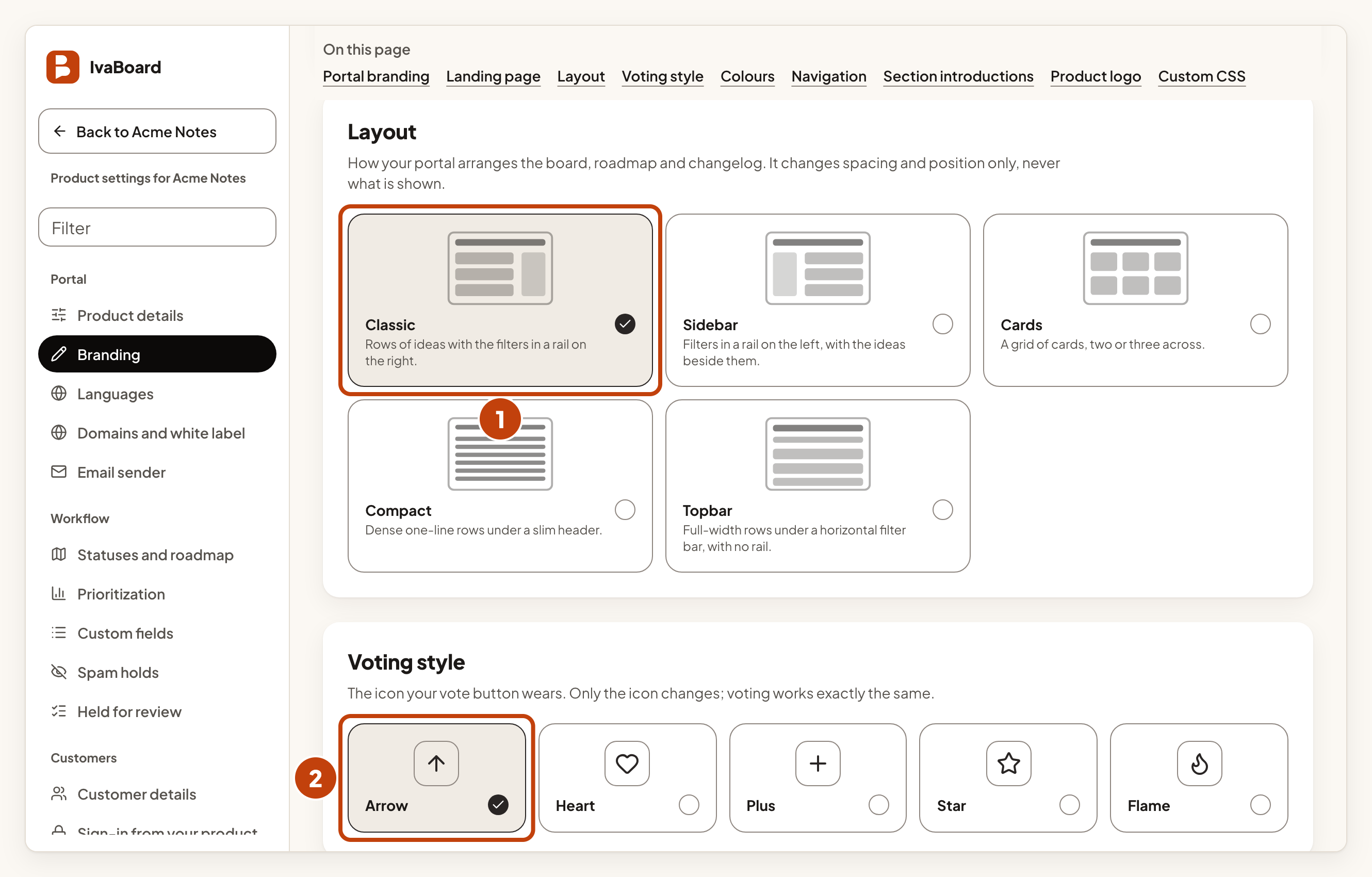
- Under Layout, choose one of the five layouts in the table below.
- Under Voting style, choose the icon for your vote button: Arrow, Heart, Plus, Star or Flame.
| Layout | What it looks like |
|---|---|
| Classic | Rows of ideas with the filters in a rail on the right. |
| Sidebar | Filters in a rail on the left, with the ideas beside them. |
| Cards | A grid of cards, two or three across. |
| Compact | Dense one-line rows under a slim header. |
| Topbar | Full-width rows under a horizontal filter bar, with no rail. |
A layout changes spacing and position only. It never changes what is shown. The vote icon changes only the icon. Voting works the same way.
Set your own colours
- In Custom accent colour, type a colour, such as #2f43b8. This is optional.
- In Header colour, type a colour for the header in the light theme. This is optional.
- In Page background colour, type a light colour for the page in the light theme. This is optional.
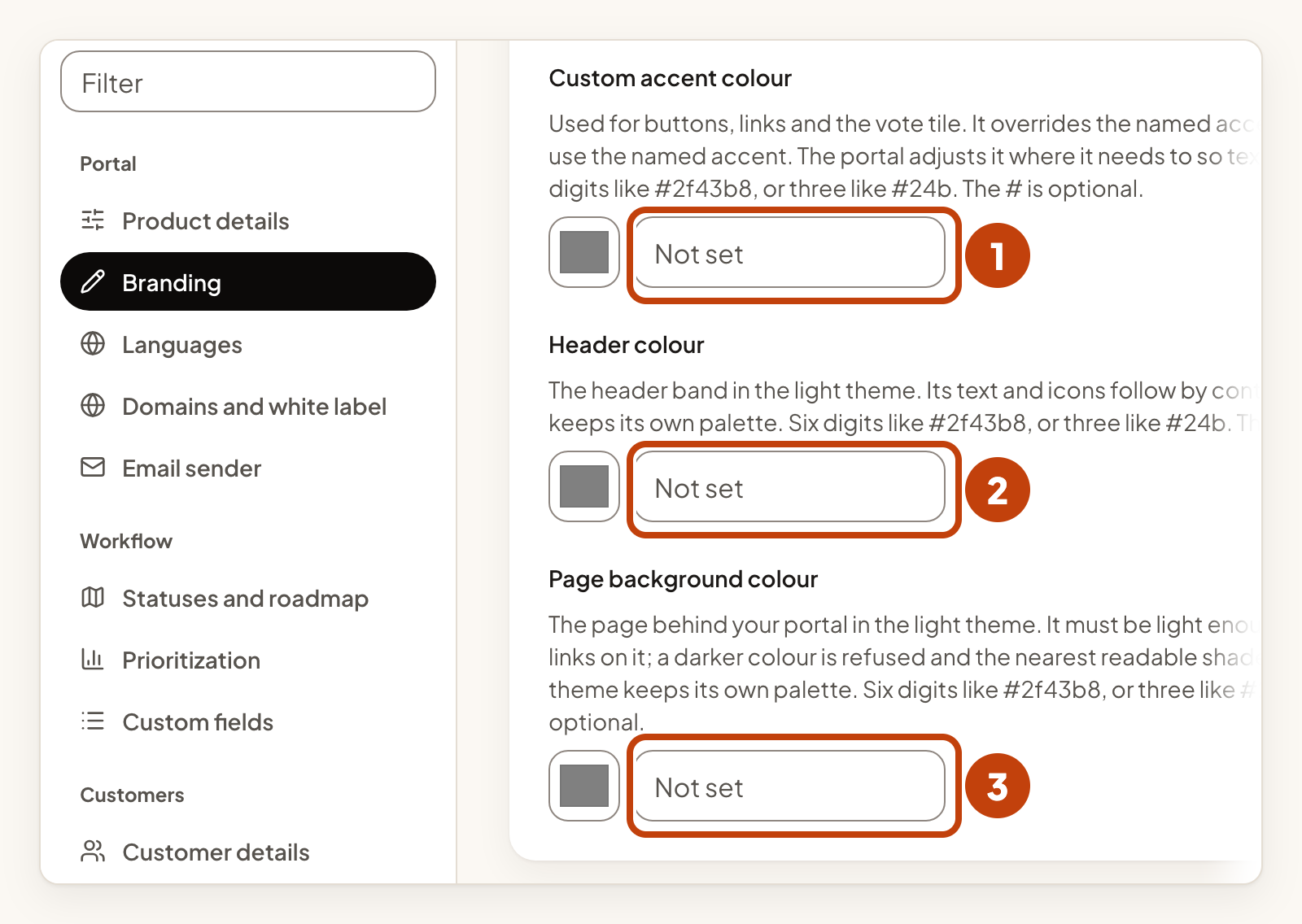
Type six digits, such as #2f43b8, or three, such as #24b. The # is optional. Clear a box to go back to the default.
If a colour is too close to the text colour, the portal uses a nearby shade. The page says so under the box, for example "Shown as #2f43b8 so text stays readable." A page background that is too dark for the light theme is refused, and the page offers the nearest readable shade.
Save your choices
- Select Save appearance.
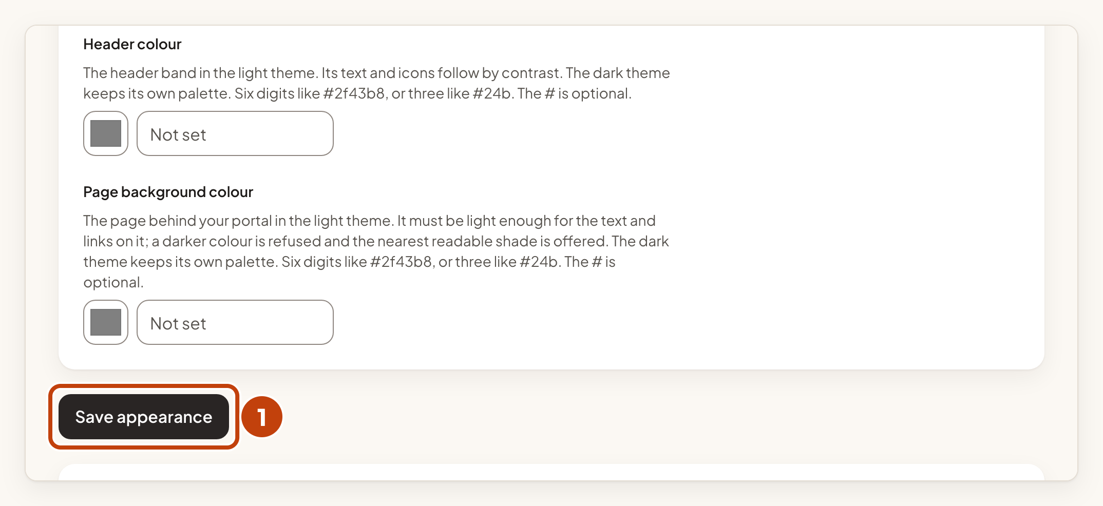
The landing page, layout, voting style and colours share one Save appearance button. A mark named Unsaved changes shows beside the button while a choice differs from what is saved. Nothing changes for your customers until you save.
Example
For example, Sam at Acme Notes chooses Feedback under Landing page and Cards under Layout. Sam types #2f43b8 in Custom accent colour, then selects Save appearance.
